Work
9 projects Case study 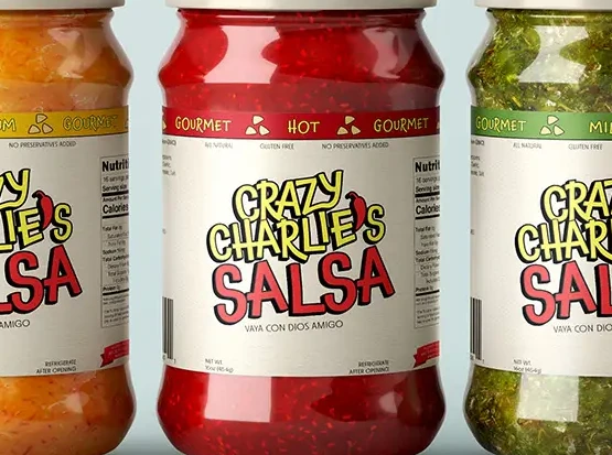
Click to read more
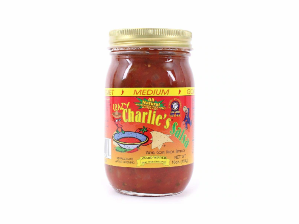
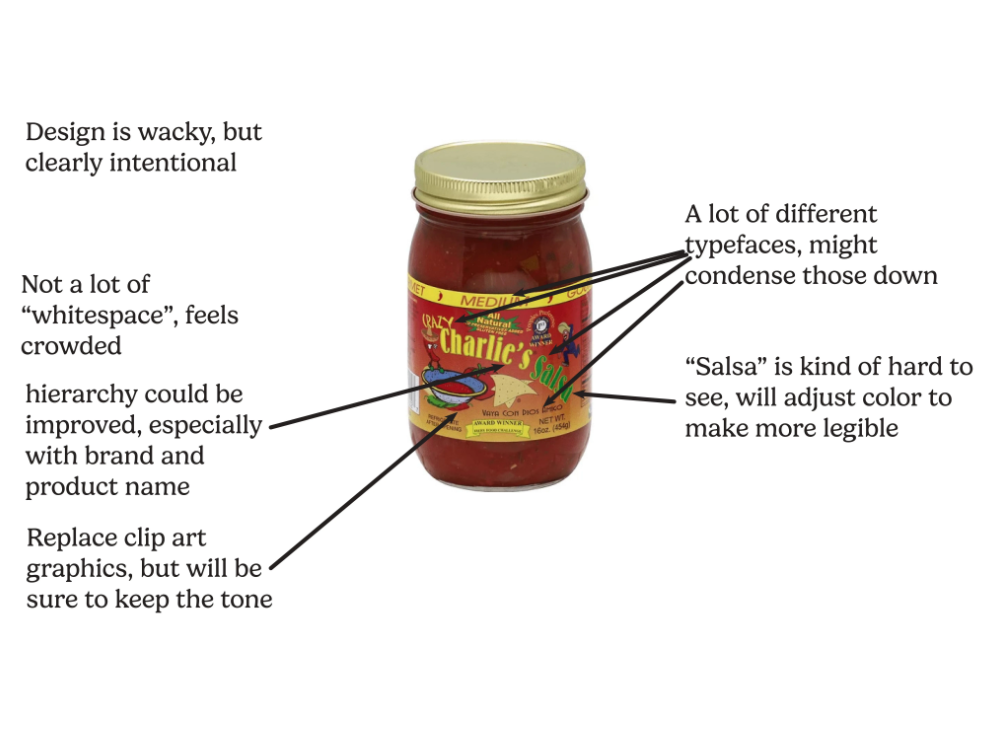
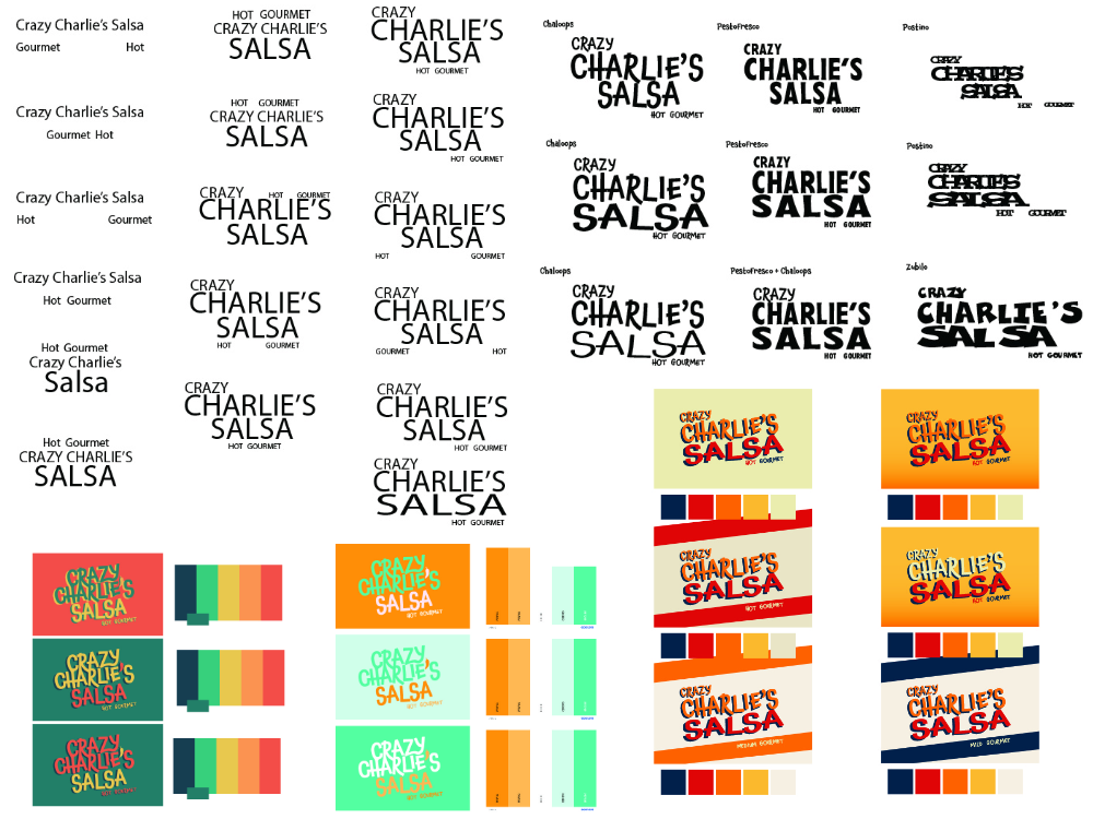
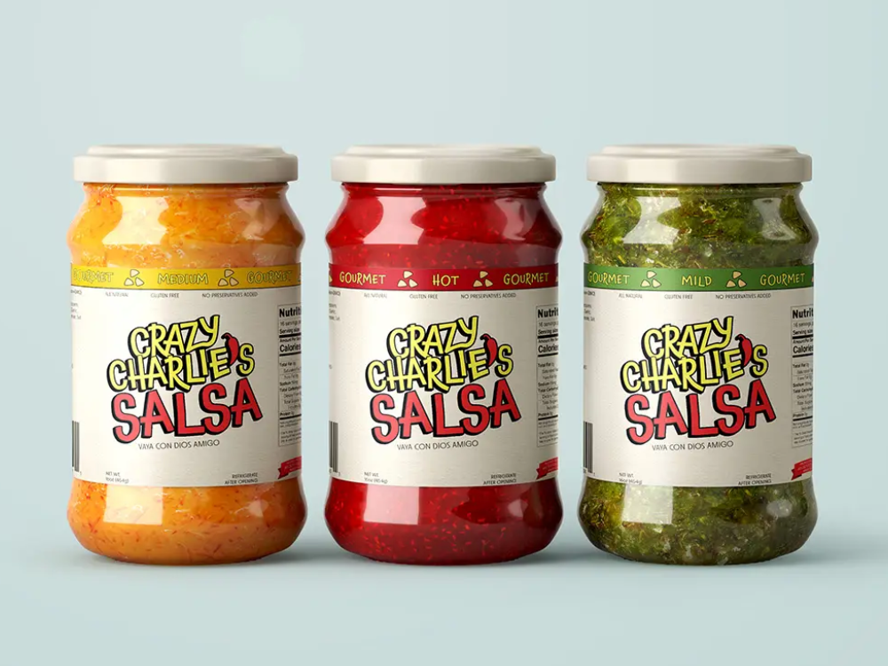
Crazy Charlie's Salsa
Gallery 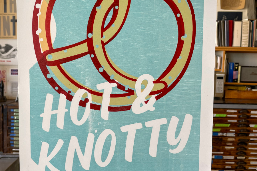
View images
Hot & Knotty
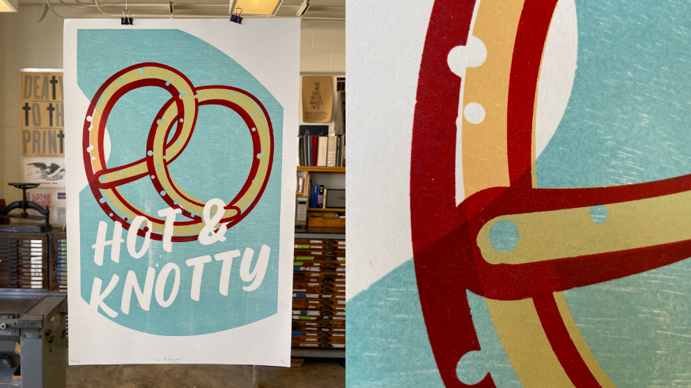
Hot & Knotty print hanging in the print shop
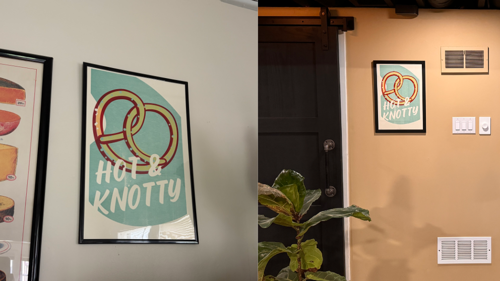
A few prints framed in my house and my brother's house
Gallery 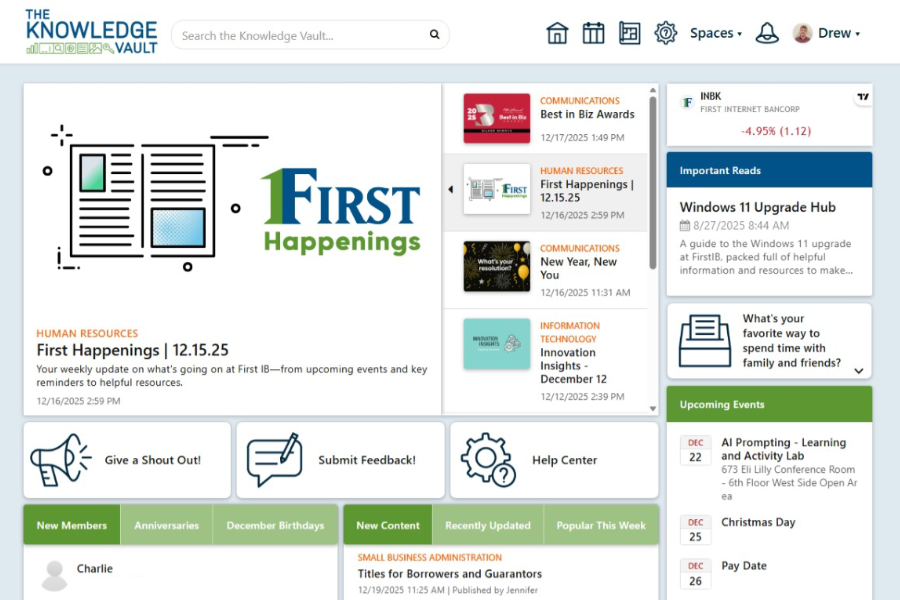
View images
The Knowledge Vault Intranet
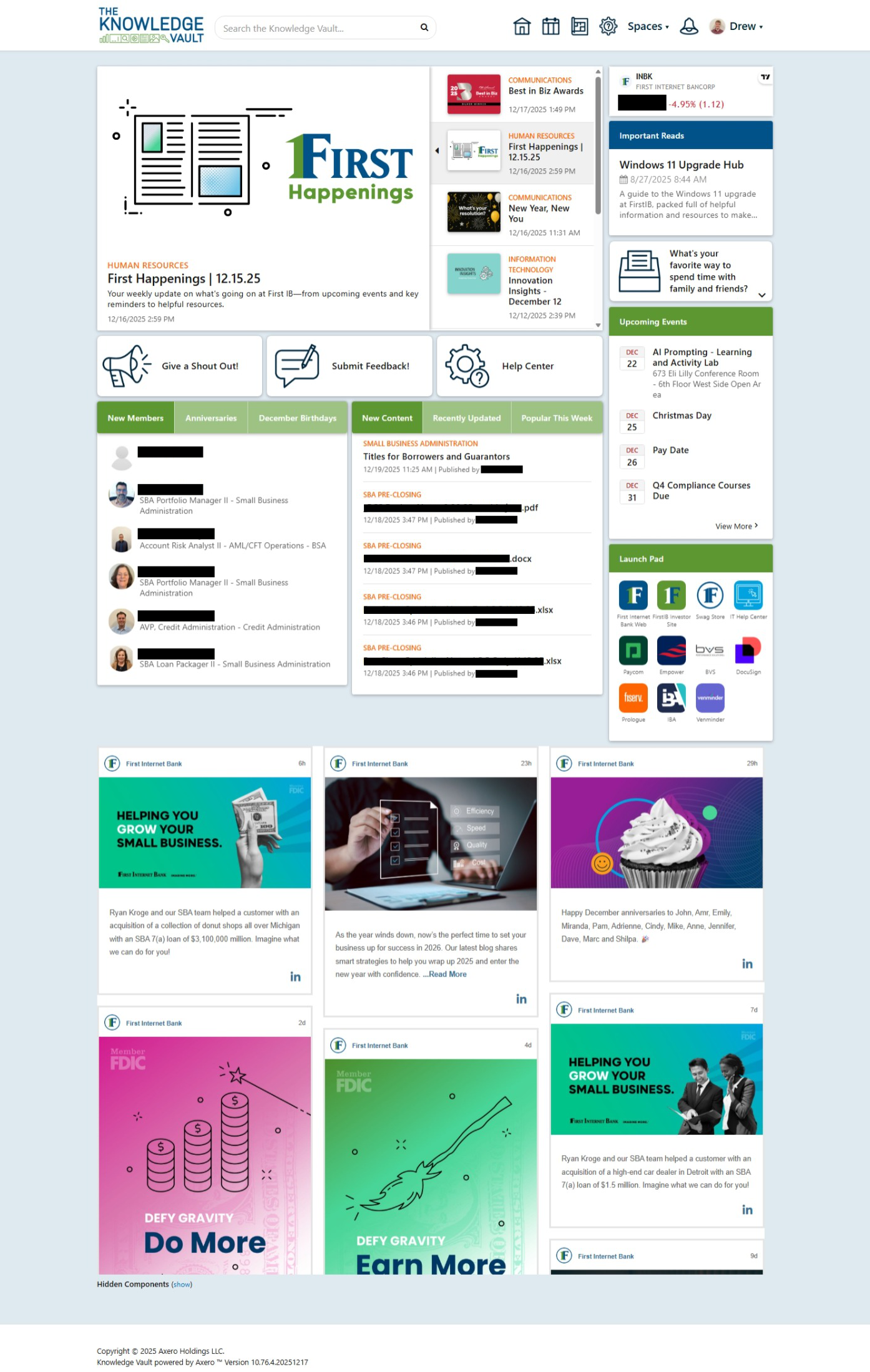
New home page—featuring an overhauled navigation bar, a custom built announcements carousel, a custom-built dropdown widget to display company surveys and polls, and a custom-built widget with easy tab functionality to allow for multiple widgets to occupy the same space. This widget was actually featured on Axero's Builder Showcase (see next slide).
Scroll to explore!
Scroll to explore!
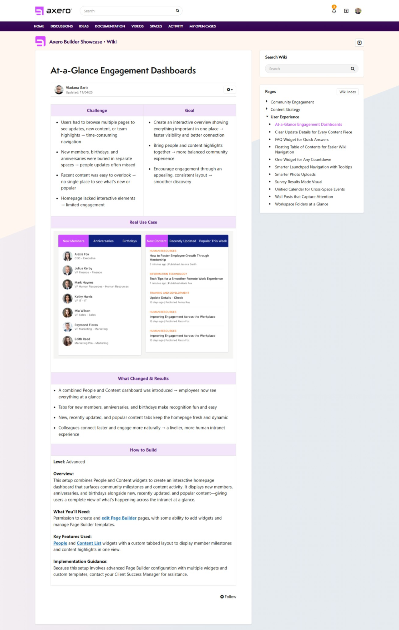
Axero's Builder Showcase showing my custom-built widget. The purpose of the builder showcase is to show their clients what their platform is capable of in terms of customization.
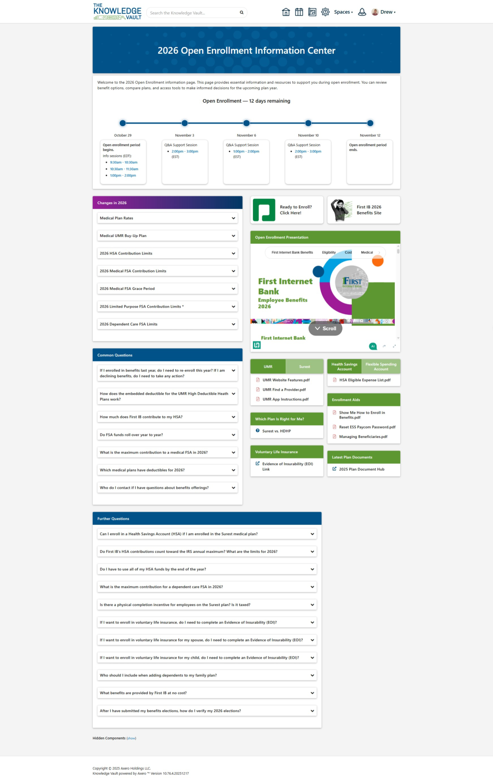
A temporary page for employees to find benefits information during their open enrollment period. Human Resources was inundated with questions every year about benefits. This was a solution to that problem by providing an easy to access place to answer all of the most common questions they would receive. At the top was also a custom-built timeline that updated daily to reflect important information and events throughout the enrollment period. Not only did HR receive fewer questions, but they now had a resource to refer to when answering them. It was a huge success, and made the open enrollment period much less stressful for a lot of employees.
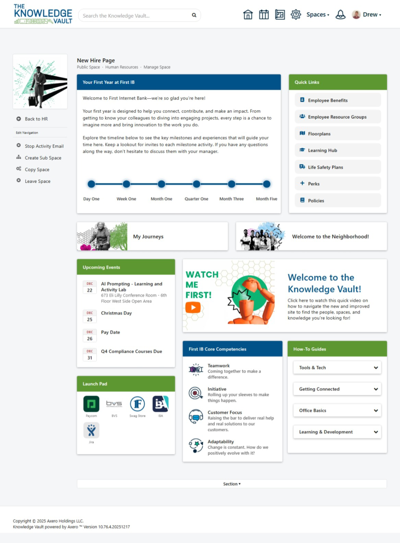
This was a space on the intranet I developed with the Human Resources department. My job was to identify their needs for onboarding in the intranet, then build a space that meets them. I had a lot of freedom in terms of design, and I wanted to make something interactive and engaging. The timeline is custom-built and hooks into the employee's start-date automatically, filling in the timeline as they progress through their onboarding. Employees are able to hover over each milestone and see what they will be accomplishing by then.
This is a template I developed at the end of my internship for a complete redesign of every department's individual spaces featuring custom widgets I built. While each department had unique needs, their pages were built out when the intranet was in its infancy, and they had a lot more potential. The goal was to create a template that every department could use and edit to their needs. This way, every department page would be structured similarly to one another, making it easier to navigate the intranet as a whole. It also included dynamically hidden tools in the bottom to help space moderators manage content.
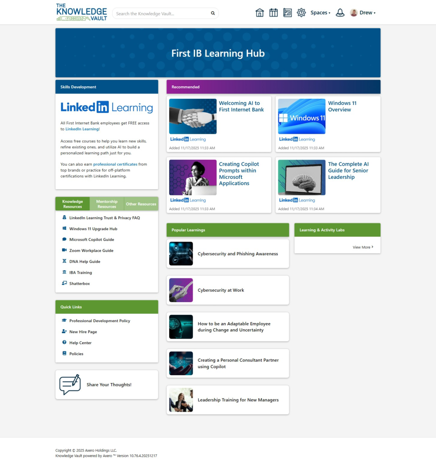
Another page built out for Human Resources, this was a page to highlight their new benefits offering: LinkedIn Learning. It was also meant to serve as a place to find other learning resources on and off the intranet. Additionally, I developed a custom survey form at the bottom of the page for employees to share specific feedback about the learning hub directly with HR.
Gallery 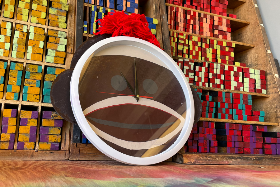
View images
Sock Clock
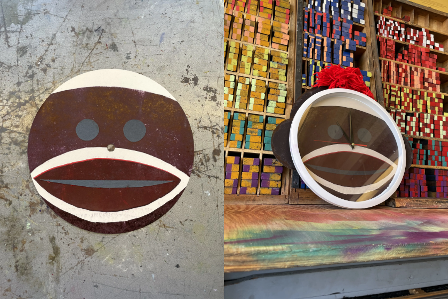
My final project for my Letterpress printing class—a clock. A sock clock! Functional, but unfortunately I messed up the color layers and it came out a little darker than I intended. But, a valuable lesson and I had fun making it nonetheless.
Case study 
Click to read more
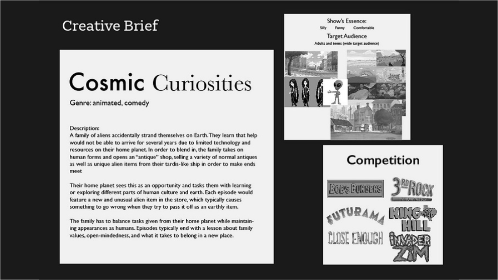
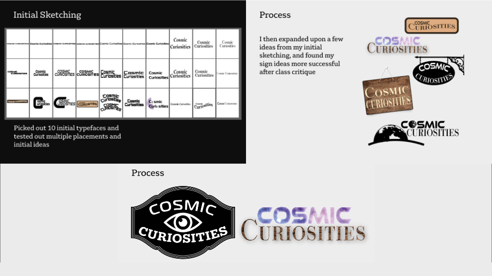
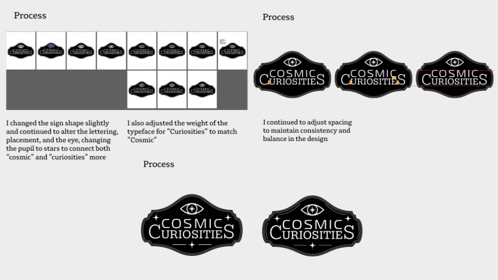
Cosmic Curiosities

Gallery 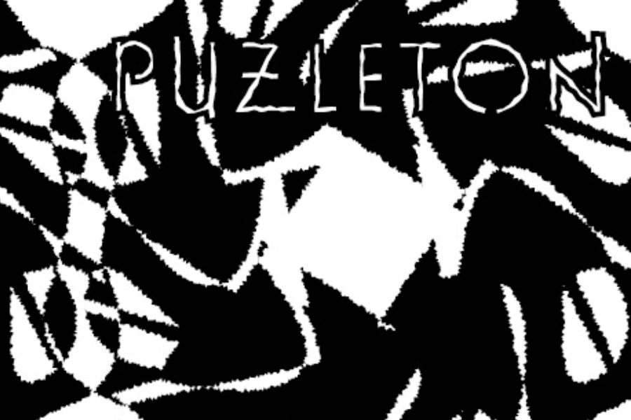
View images
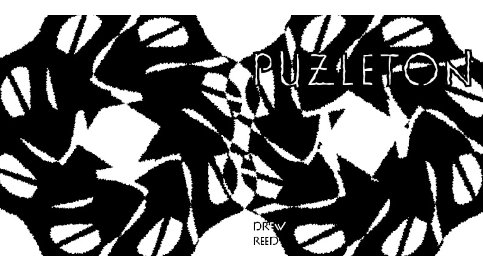
Puzleton
Cover spread

Inner-sleave spread
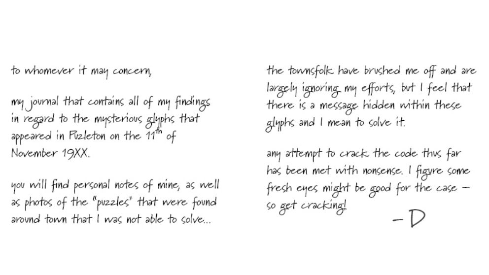
Spread one — the letter
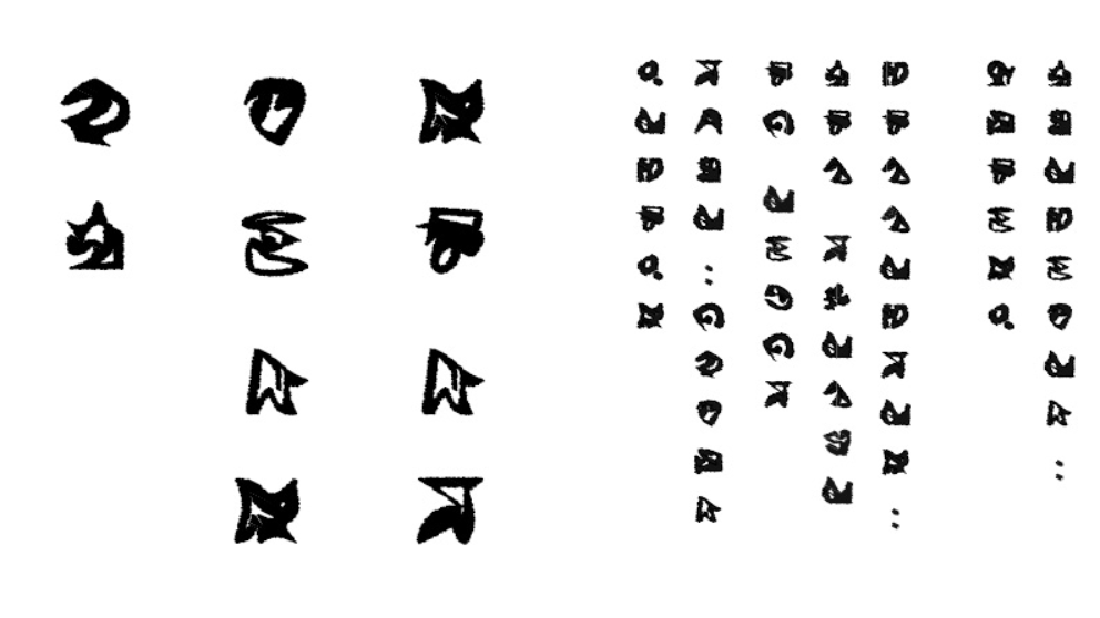
Spread two — the message
Spread three — the answer

Spread four — wit

Spread five — steps

Spread six — coordinate
Spread seven — lost
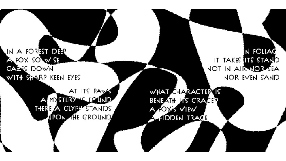
Spread eight — riddle
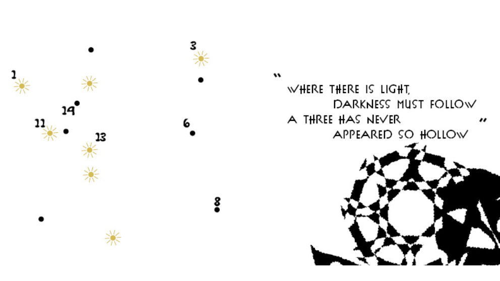
Spread nine — dots

Spread ten — end
Case study 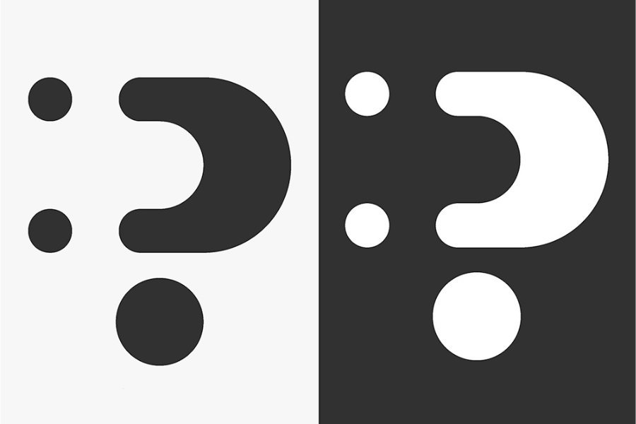
Click to read more
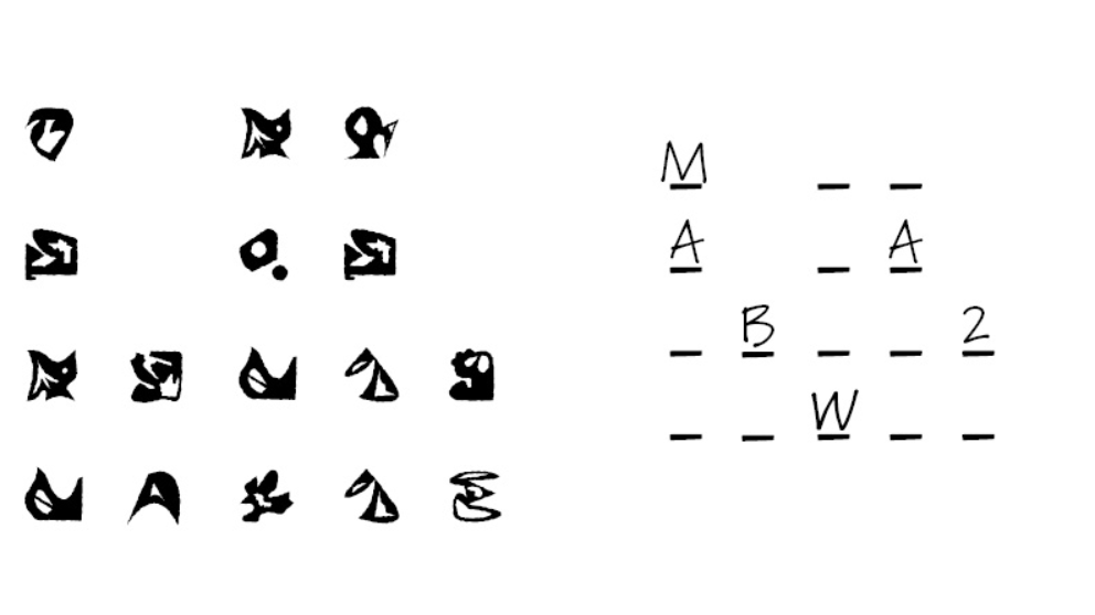
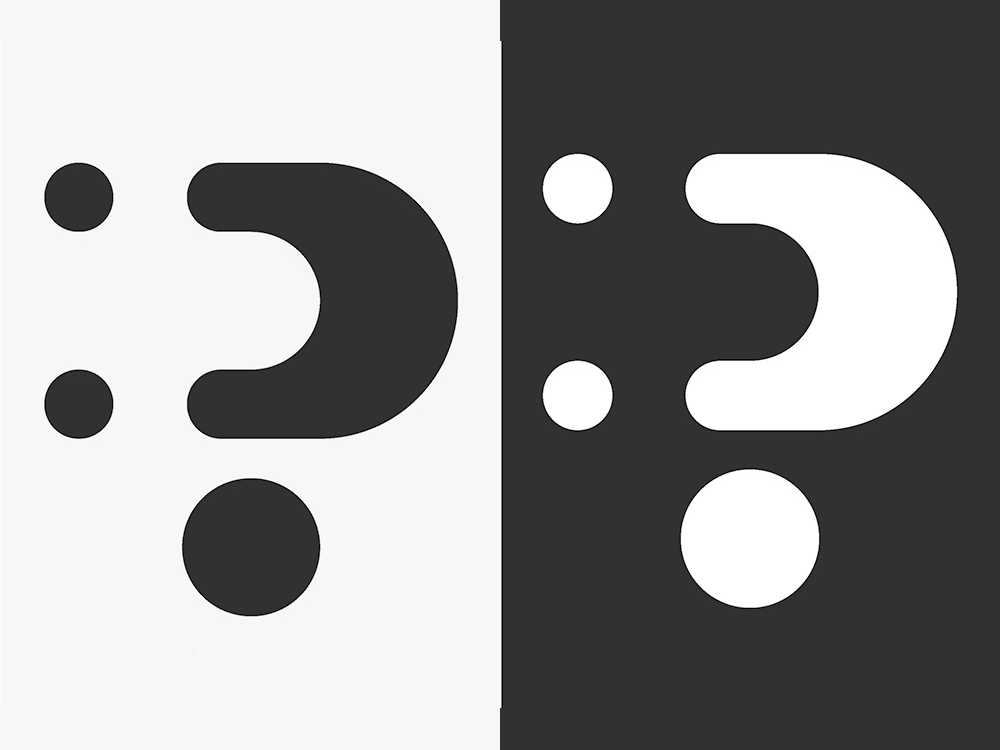
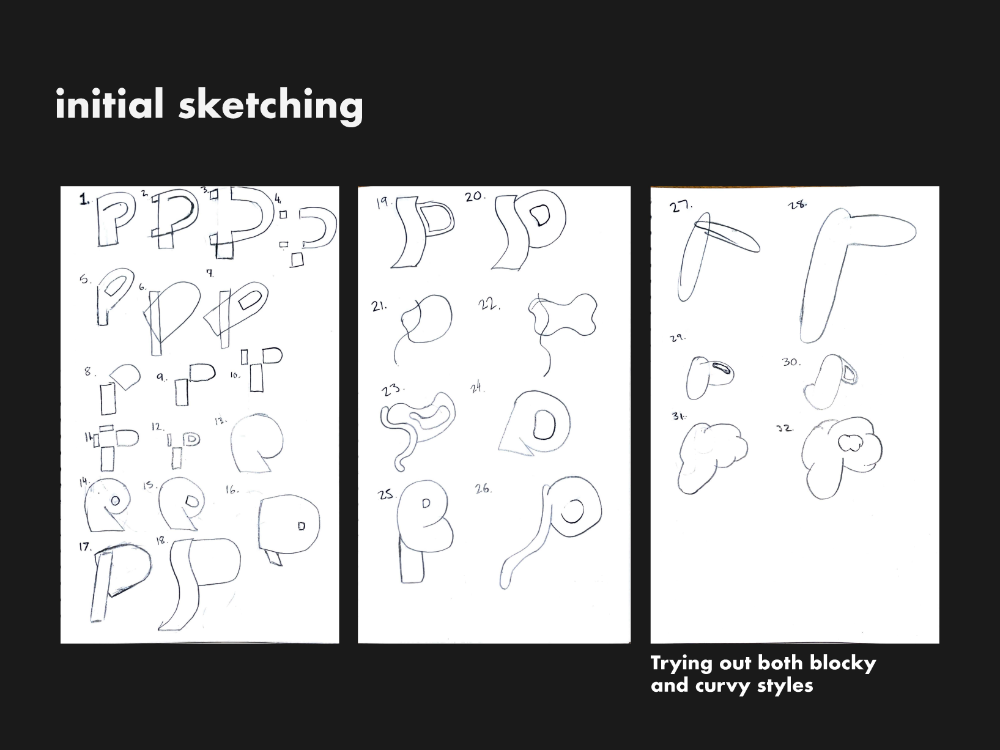
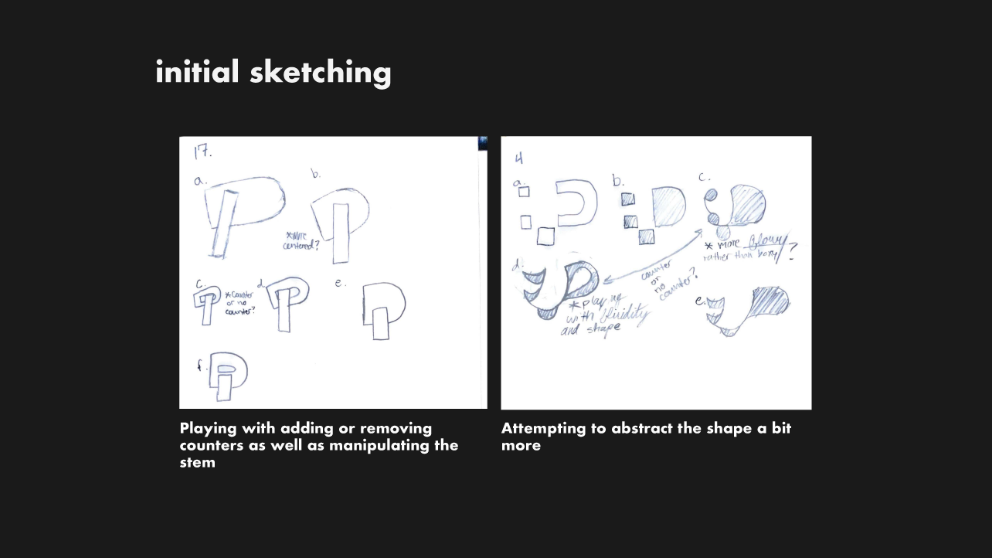
P — Letter Abstraction
Gallery 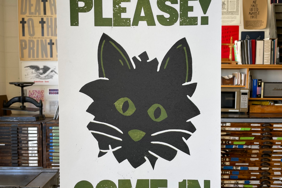
View images
Please! Come in
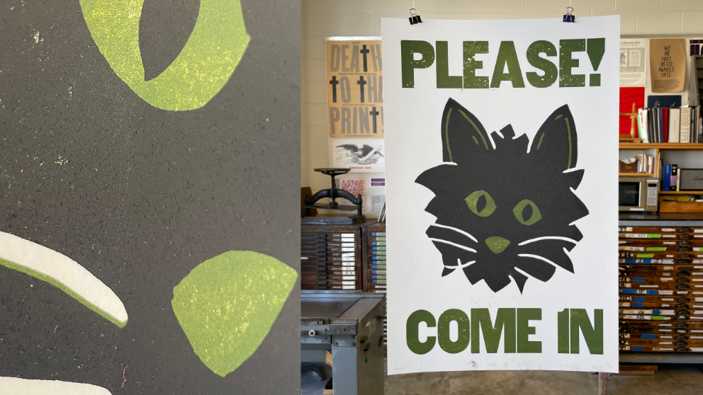
Please! Come in print hanging in the print shop
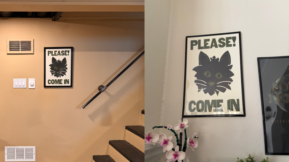
A few prints framed in my house and my brother's house
Gallery 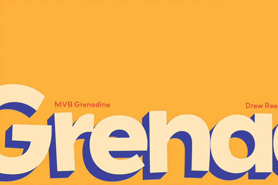
View images
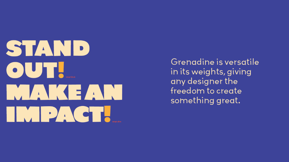
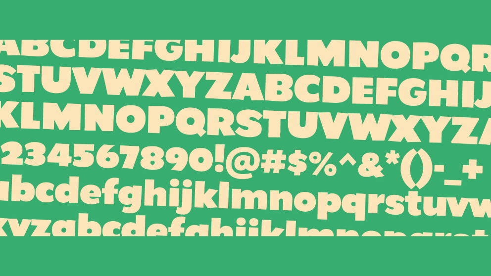
Grenadine — Type Specimen Book
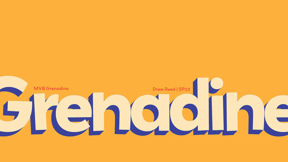
Cover spread
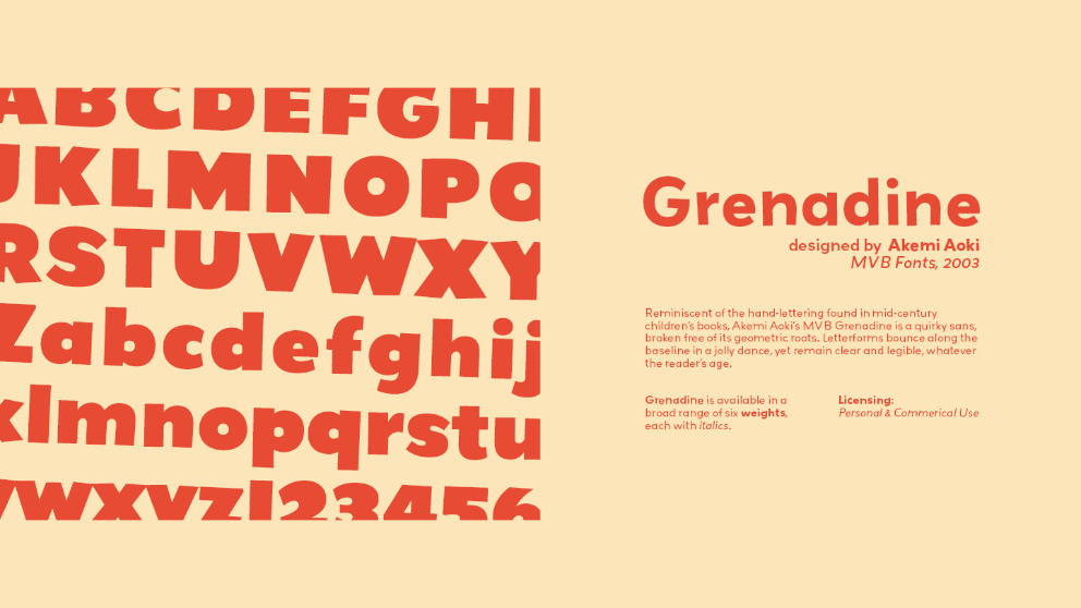
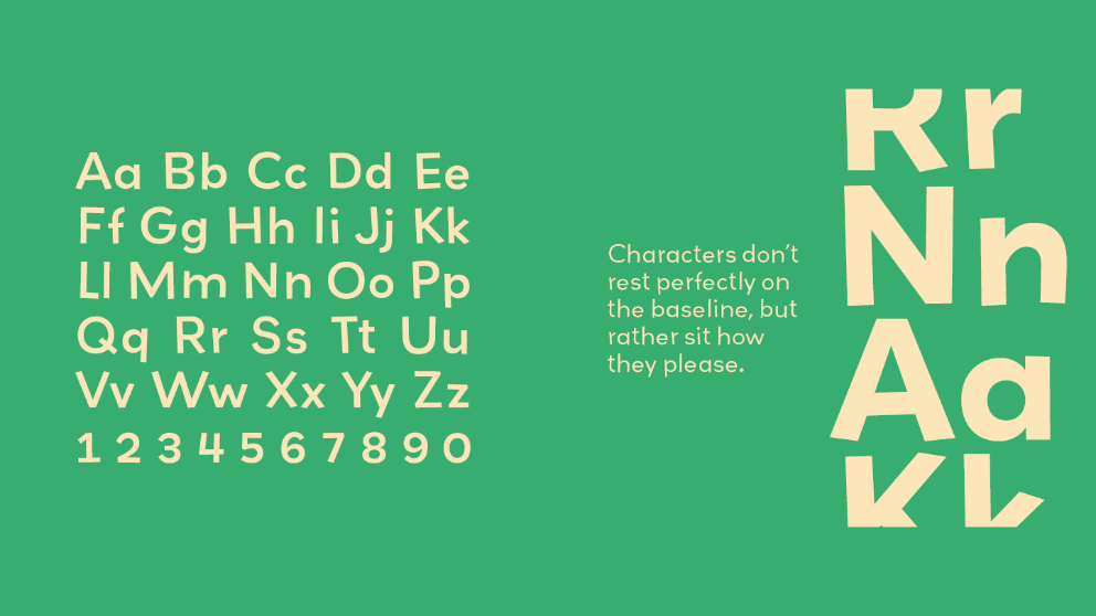
Spread one
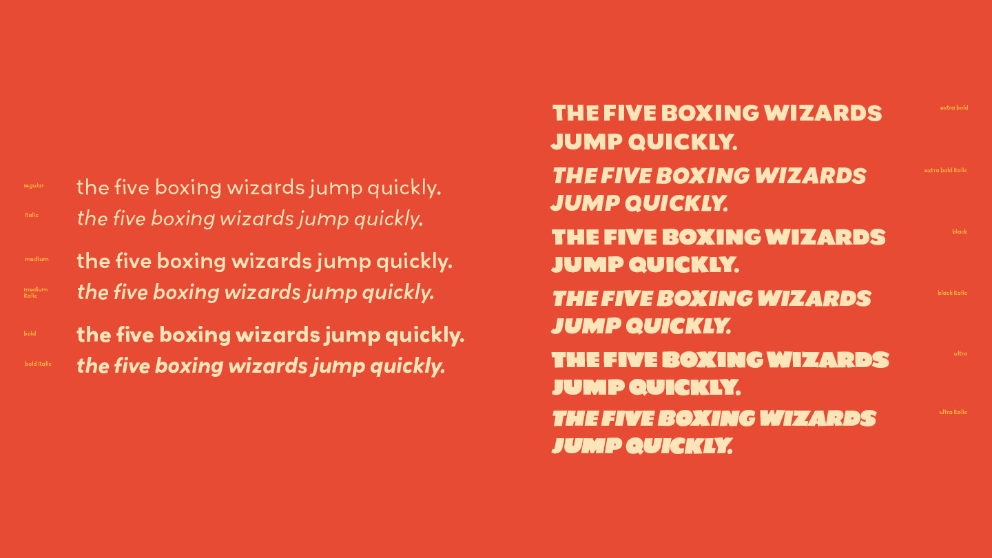
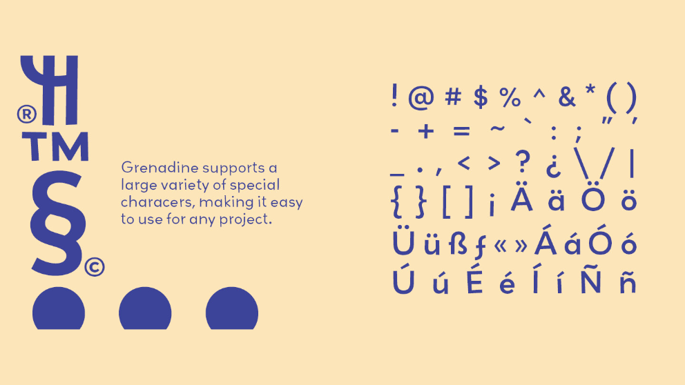
Spread two

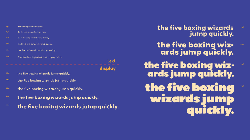
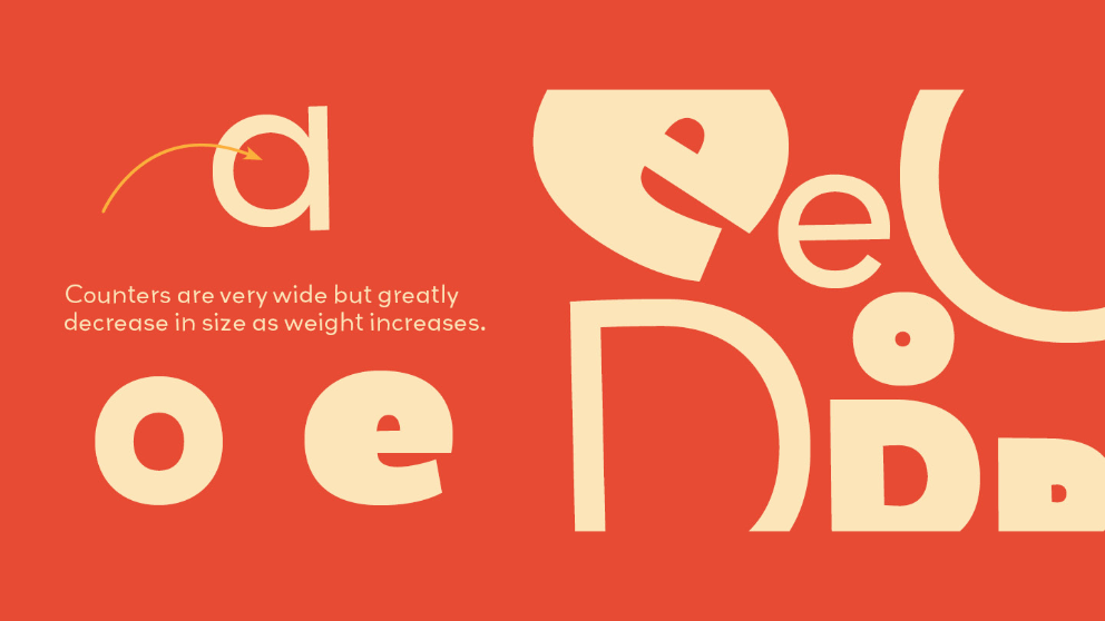
Spread three
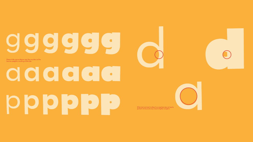
Spread four
Spread five
Spread six
Spread seven
Spread eight
Spread nine
Inner-sleeve spread
